18 Aug 2015
Belle
Building Exist for iOS: introducing the dashboard
I’m starting a new series of posts here on the Hello Code blog to share my journey creating the iOS companion app for Exist. It’s the first app I’ve ever created (iOS or otherwise), having taught myself Objective-C over the past year. It’s also one of the first two apps (the other being our companion app for Android, built by Josh) to use the Exist API.
If you haven’t heard it already, we talked about our mobile apps and some of the differences between them on our podcast in June.
These posts will go into a bit more technical detail than the podcast. They’ll explore some of the problems I’ve run into, mistakes I’ve made, and workarounds I’ve found, as well as how I go working with the Exist API.
Starting out
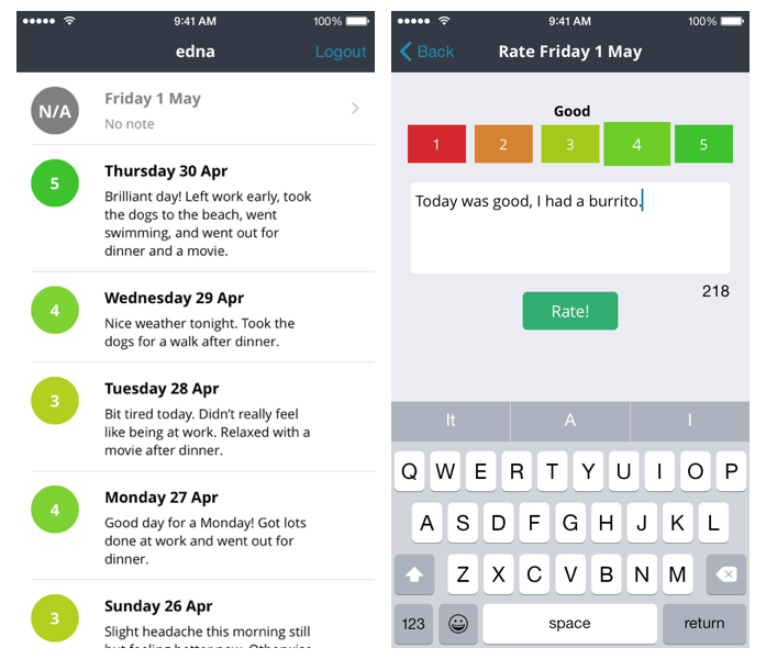
My Exist for iOS app started out as a mood tracker only. The current version available to the public is still just a mood tracker.
The reason for this is simple: we initially put off creating mobile apps—although we wanted to—because with just one developer (Josh), we knew it would be a stretch to keep up with all the work to be done to the web app and add even one more platform. There was no way both Android and iOS apps could be done alongside the web without any of them languishing.
I’ve been attempting to learn to code for the web on and off for the last few years, but when I started with Objective-C it finally clicked for me. I love iPhone apps—I switched from an Android phone back to an iPhone years ago purely for the apps—and making my own was the motivation I needed to finally stick with programming.
When it came time to choose my own project, after working through many app tutorials, I wanted something I cared about that was small enough in scope that it wouldn’t be too far over my head as a beginner.
Josh and I agreed taking a tiny part of the Exist web experience—mood tracking—would make for a simple app that covered some aspects I’d already learned about, like table views and downloading JSON data from an API. It also meant Josh could help me when I got stuck working with the API or needed help planning the design of the app.
When I really got stuck into Exist for iOS, Josh’s vigour for the Android version was renewed and he started working on it whenever he had time. Being the seasoned developer that he is, Josh’s Android version was released earlier than mine with a lot more packed in, so I’m now in the process of working to catch up.
My app in the store right now consists of three main sections:
- A list of mood entries from the past week.
- A screen that lets you rate today, add a note, and submit your entry to your Exist account.
- A settings screen.
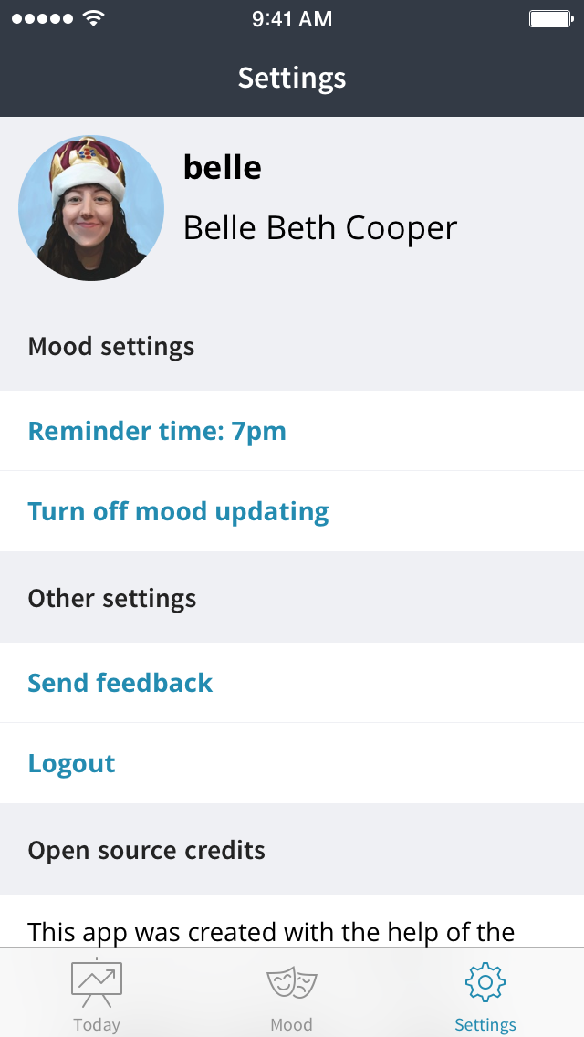
The settings screen is the most recent—and biggest—update. It includes user profile data (name, username, photo) and some options like changing the time of your mood reminder notifications.
The mood list and rating screens have stayed mostly the same since I first released the app a couple of months ago.
The dashboard
Okay, let’s get into the code.
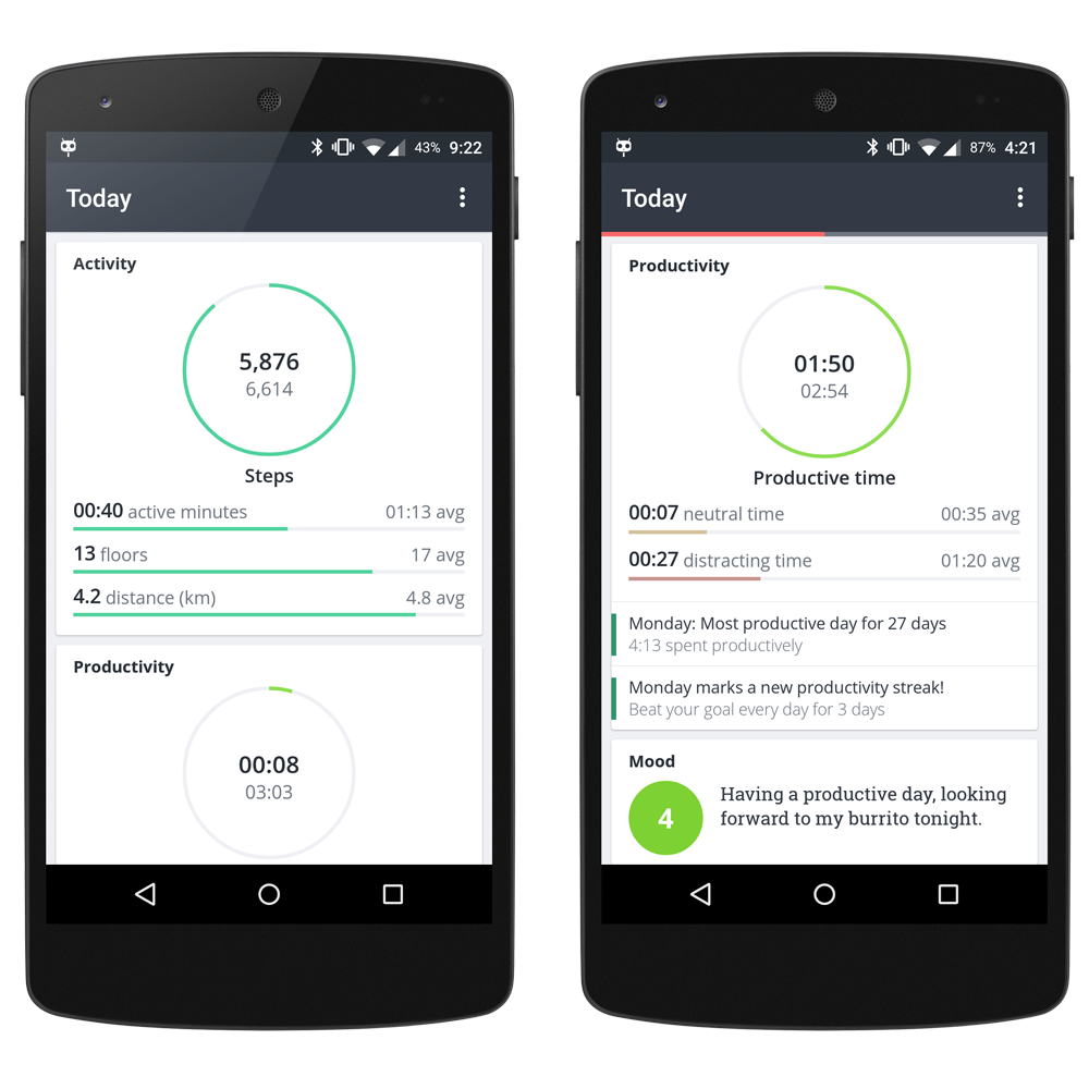
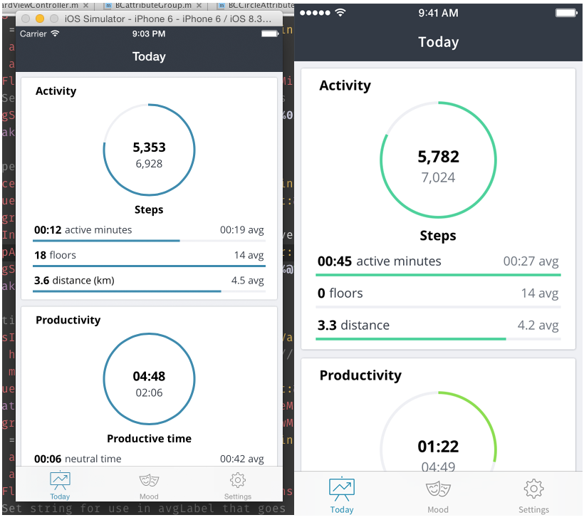
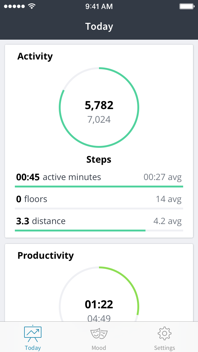
The branch I’m working on at the moment is full of major changes. The main one is that I’m introducing a “Today” view to match the Android app, which is analogous to the today tiles section of the Exist dashboard on web:
I’ve already done quite a bit of the work on the dashboard—maybe half so far—but from now on I’ll try to write up a post about each part I work on. For now, here’s a recap of what I’ve already done:
I’ve added a UITabBarController with three tabs: Dashboard, Mood, Settings. The Mood tab is essentially the old version of the app—a list of mood entries from the past week, and a rating screen if you tap on one that hasn’t been rated.
The settings screen is a UITableViewController with some profile info, open-source library credits, a logout button, and a couple of mood service options: you can set the app to be your mood service or not (we also have an email option you can set up on the web version of Exist) and you can change the time your reminders arrive at night.
The “Today” dashboard tab is the newest, most exciting—and most fragil—tab.
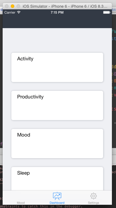
When I started the dashboard, my first step was to figure out how to create the card-style layout that Josh uses in his Android app. Here’s a refresher of what it looks like:
Each card has a heading: Activity, Productivity, Mood. On the right-hand side you can see there are some insights under the data, but they’re attached to the card. The grey background shows where each card starts and stops.
I debated how to do this for a while, and researched different options like using a UICollectionView with just one column or using a UITableView with custom cells.
I ended up going with an entirely custom view setup, just like Josh has done with his Android app. Because the dashboard is entirely dynamic, it made the most sense to do it this way. The dashboard pulls data from the user’s Exist account on the server, and because there’s an Android app and a web app, the data can change in-between uses of the iOS app. I need to be able to set up the dashboard differently depending on what data the user needs to see, and having complete control of the layout lets me do that.
Card views
My custom view setup works like this:
I have a UIScrollView set to be my standard view controller’s self.view. The scroll view holds a standard view called _mainView. This is where all of the “card” subviews go, since I ran into issues when putting subviews directly into the scroll view and using AutoLayout. The way I’ve found to get the scroll view’s contentSize property to act the way I expect it to, and all the subviews to respect the AutoLayout constraints I give them, is to put all the subviews inside _mainView, set _mainView’s translatesAutoresizingMaskIntoConstraints to NO, and not change translatesAutoresizingMaskIntoConstraints on the scroll view.
So inside _mainView I have these “cards”, which are just UIViews. I set them up like this:
UIView *view = [[UIView alloc] initWithFrame:CGRectMake(20, 20, 280, 200)];
view.backgroundColor = [UIColor whiteColor];
view.layer.shadowColor = [[BCConstants headerGrey] CGColor];
view.layer.shadowOpacity = 0.4f;
view.layer.shadowOffset = CGSizeMake(0.2f, 0.2f);
view.layer.shadowRadius = 1.0f;
view.layer.cornerRadius = 2.0f;
view.contentMode = UIViewContentModeScaleAspectFit;
[view setContentHuggingPriority:UILayoutPriorityDefaultHigh forAxis:UILayoutConstraintAxisVertical];
I use a class called BCConstants to return colour and font values so I can keep using the same colours and fonts throughout the app without typing them out over and over. These views have tiny shadows around them and rounded corners to make them look like cards.
I’m initialising with a frame here, but it doesn’t really matter since I use AutoLayout constraints to position all my views, so that frame will be overridden later.
My first step was to make classes that create one of these card views, insert their own group name (e.g. “Activity”) as a label and return the view. Then I used AutoLayout constraints in the dashboard’s view controller to lay them out one after another.
The Exist API returns data that looks like this:
attributes: [
    {
        "group": "activity",
        "label": "Activity",
        "priority": 1,
        "items": [
            {
                "attribute": "steps",
                "label": "Steps",
                "value": 562,
                "service": "misfit",
                "priority": 1,
                "private": false,
                "value_type": 0,
                "value_type_description": "Integer"
            },
            {
                "attribute": "steps_active_min",
                "label": "Active minutes",
                "value": null,
                "service": "misfit",
                "priority": 2,
                "private": false,
                "value_type": 3,
                "value_type_description": "Period (min)"
            },
Each of my “card” views is created and returned by a class representing a group in the API. In this case the group would be activity. The group class creates the card view, then populates it with views returned by classes representing each of the attributes.
Attribute classes
I have a couple of basic attribute classes—one that returns a horizontal progress bar and one that returns a circle progress bar. These are my fall-backs for anything generic. The rest of the attributes that need extra attention are subclasses of these basic attribute classes.
Both the basic attribute classes contain two switch statements to check what type of data I’m dealing with. The types could be any of the following:
- integer
- float
- string
- percentage
- time period (minutes)
- time of day (minutes since midnight)
- time of day (minutes since midday)
The first switch statement formats the value of the attribute (for instance, the step count or the time spent asleep) based on what type it is. The second statement finds the average for that attribute (I download these separately from a different API endpoint) for today’s day of the week and formats it depending on what the value type is. We use averages as goals, so our users are always aiming for goals that suit them.
Here’s an example from my averages switch:
case TIME_SINCE_MIDDAY:
   // time of day (mins from midday)
   avg = [[averages valueForKey:todayString] intValue];
   avgFloat = (float)avg;
   int avgHrsFromMidday = (avg / 60) + 12;
   int avgMinsFromMidday = avg % 60;
   // Set string for use in avgLabel that goes inside circle graph
        _avgString = [NSString stringWithFormat:@"%02.02d:%02.02d", avgHrsFromMidday, avgMinsFromMidday];
        break;
Eventually I’ll add a regular background task to download the averages weekly (Exist saves new averages on Sundays), which is what Josh is doing in his Android app. So far I’ve got as far as caching them after downloading, and checking the cache in the dashboard’s viewDidLoad method. If the cache is empty I download the user’s averages from the server.
At first I didn’t use the averages at all. I started by just creating two labels for each attribute (name and value) and adding them as subviews to the group’s card view:
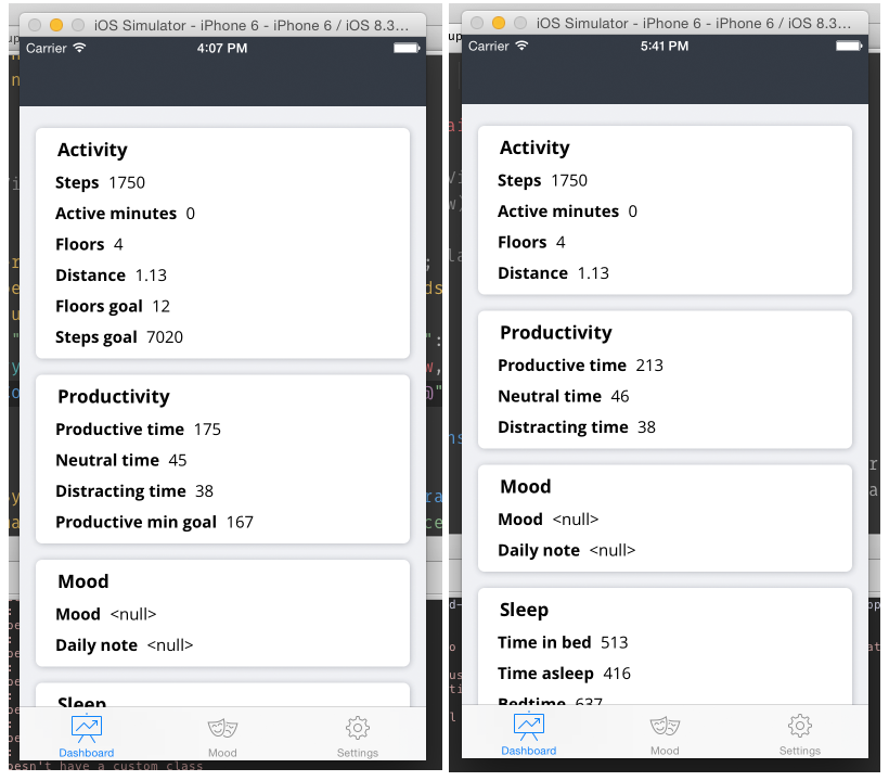
You can see in the two screenshots above that I was including all the data I got back initially, which included goals. There are also some static values in the data returned by the API, such as the user’s Twitter username, which I didn’t need. The priority value in the attribute data returned by the API lets me filter these out—anything with a priority higher than 9 is one of these “auxiliary” attributes that are useful throughout the app, but don’t need their own progress bars on the dashboard. In the right-hand side screenshot above you can see that my next step was to only show attributes with a priority higher than 9.
Horizontal progress bars
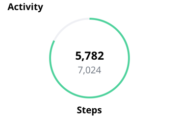
A horizontal progress bar attribute looks like this:

It has three labels:
- current value
- name of attribute
- average value followed by “avg” string
And obviously it has a progress bar.
I started out with YLProgressBar for creating the horizontal progress bar, but it didn’t offer enough customisation for me to get it just right. Because I’m matching the web and Android versions of Exist, I need to get everything as consistent with those as possible, while also keeping in mind iOS conventions.
After YLProgressBar didn’t work out I tried customising the built-in iOS progress bar, UIProgressView. I came very close to getting what I wanted, but there were a couple of small things I couldn’t change that ended up being deal breakers (I don’t remember what they were now, or else I’d tell you).
I ended up using LDProgressView. It lets me customise enough to make the bar look and behave the way I want. The only issue I have is that there’s no option for changing the duration of the animation, which I’d like to do so the horizontal bars match the animation duration of the circle progress bars.
Here’s how I set up and customise the horizontal bars:
_valueProgress = [[LDProgressView alloc] initWithFrame:CGRectMake(0, 0, view.frame.size.width, 3.0f)];
_valueProgress.type = LDProgressSolid;
_valueProgress.color = groupColor;
_valueProgress.progress = [self getPercentage:progressFloat withAverage:avgFloat];
_valueProgress.flat = @YES;
_valueProgress.borderRadius = @0;
_valueProgress.showStroke = @NO;
_valueProgress.animate = @NO;
_valueProgress.background = [BCConstants backgroundGrey];
_valueProgress.showBackground = @YES;
_valueProgress.showBackgroundInnerShadow = @NO;
_valueProgress.showText = @NO;
[view addSubview:_valueProgress];
The view this is being added to is created and returned by an attribute class, so it only contains a single attribute and the labels and progress bar related to it. When this view is returned to the group class to put into its card view, the group class will lay it out with a little padding to each side, so it’s fine for the progress bar to be the full width of the attribute view it’s being added to.
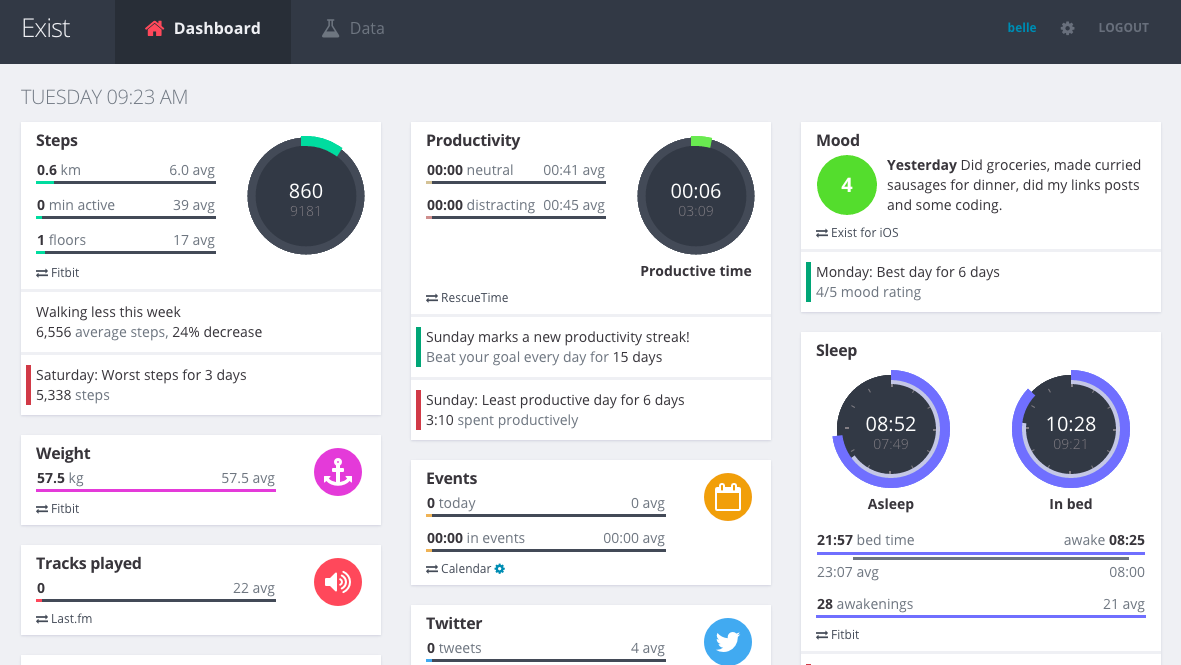
The groupColor variable is passed to the attribute class by the group class when it calls this method to create and return the attribute’s view. Each group has a particular highlight colour, which I grabbed from the web version of Exist so they match. You can see below how the activity group’s attributes all use the same green colour, but the productivity attributes are using a different shade. In the early screenshots you’ll see I’m using blue for everything—that’s a highlight colour we use throughout the app for buttons and labels, so I used it as a placeholder and added the custom group colours more recently.
The rest of the code above is pretty self-explanatory, except the _valueProgress.progress method. This is setting the amount of the progress bar to be filled (it animates from 0 to this amount). The amount needs to be between 0 and 1, with 1 being full. I call a method here that takes a float representing the attribute’s current value and the user’s average for this value today (which doubles as their goal):
-(float)getPercentage:(float)value withAverage:(float)average {
// Takes the average and value and returns a float
// between 0.0f and 1.0f - this is a percentage.
// Handles if the value > avg or if the avg is 0

if (average == 0){
    return (value > average);
}
if (value > average){
    return 1;
}
return value / average;
}
If the attribute’s current value is higher than the average, this method simply returns 1, so the progress bar will be full. Otherwise it returns a float between 0 and 1 representing what percentage of their goal (average) the user has completed for this attribute so far today.
Circular progress bars
For the circular progress bars I recently switched to CircleProgressBar. I had been using BKECircularProgressView, but the CocoaPods version hasn’t been updated to allow animation, and I didn’t have any luck taking the latest version directly from GitHub, so my circle progress bars were static, while the horizontal ones animated. With CircleProgressBar I can animate the progress and even set the duration.
The setup for a circular progress bar is a bit more simple:
_valueProgress = [[BKECircularProgressView alloc] initWithFrame:CGRectMake(0, 0, 0.5f, 0.5f)];
[_valueProgress setProgress:[self getPercentage:progressFloat withAverage:avgFloat]];
_valueProgress.lineWidth = 3.0f;
_valueProgress.progressTintColor = groupColor;
_valueProgress.backgroundTintColor = [BCConstants backgroundGrey];
[view addSubview:_valueProgress];
I use the same getPercentage: withAverage method to set the progress as I do for the horizontal progress bars. Other than that, it’s just a matter of setting the line width and the colours. Everything else is done with AutoLayout constraints.
For laying out the view I use constraints to set the height and width to the same size. I set the circle’s centre x to match the centre x of its superview (again, this is a single attribute view being returned to the group class, which will add it to its group card view). I have two labels inside the circle: a value label (current value) and average label (goal based on average for today). I set the value label’s centre x to match the circle’s centre x, and make its centre match the circle’s centre y with a small vertical offset to make room for the average label underneath. Then I have a vertical constraint that positions the average label directly underneath the value label.
I’ve made a few small changes more recently, but I’ll save those for separate posts. This is all the major stuff I’ve done to get you up-to-speed. In the future I’ll try to write new posts about all the big changes I work on, and any issues I run into.
For reference, here’s what my dashboard currently looks like:
Hopefully that all made sense! Part of my reason for sharing my progress is so I can improve, by explaining my work and soliciting feedback. So if you’ve noticed anything in my code or the way the app works that I should be doing differently, let me know! You can find me on Twitter at @BelleBCooper.